Photography Tips
Unlocking Vibrancy: Elevating Your Portraits with a Pop of Color
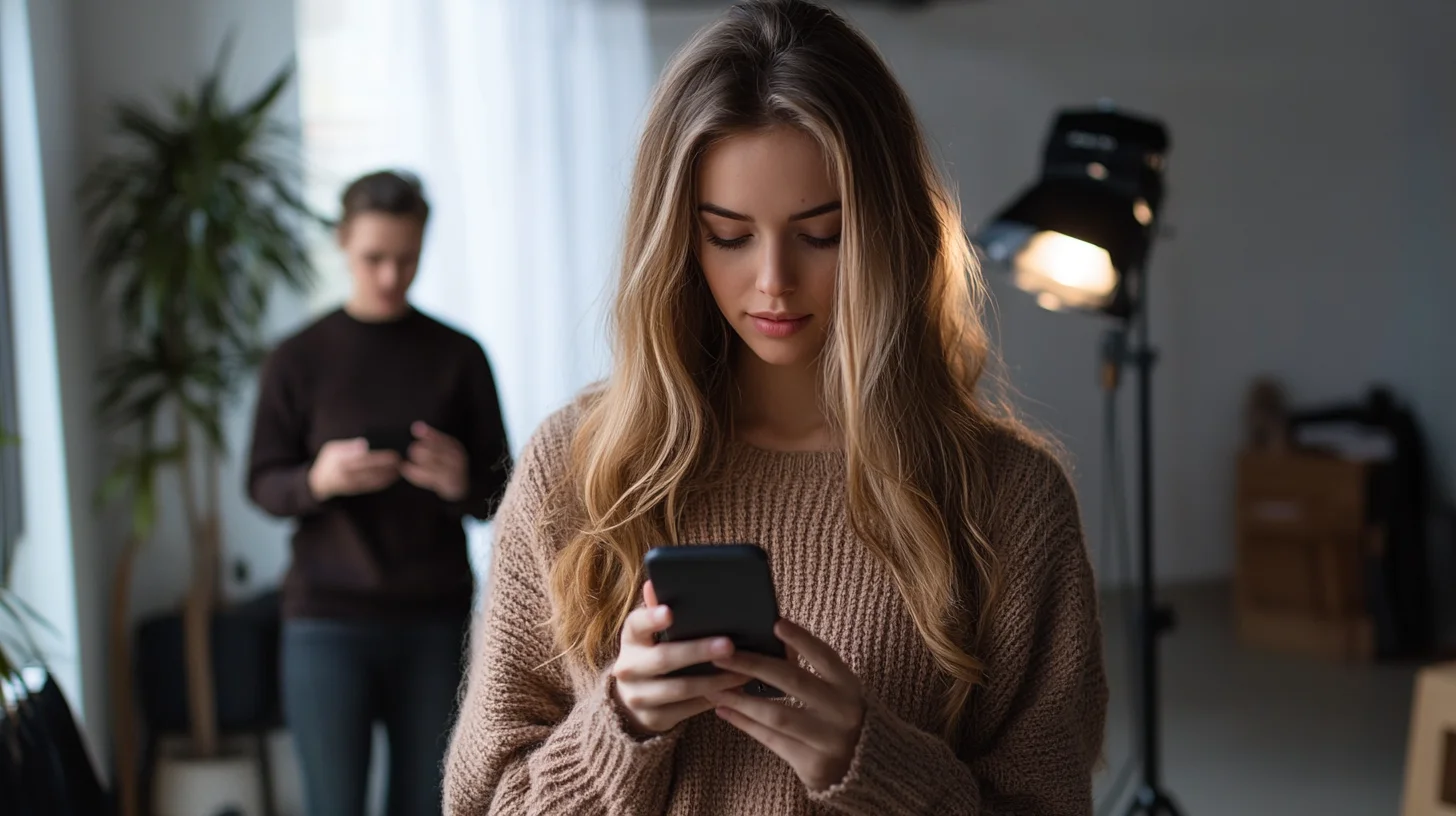
How Photography Shark's Rockland studio uses lighting gels, colored backdrops, and wardrobe to add color to headshots and branding portraits.
Chris McCarthy
Professional Photographer, Photography Shark · June 7, 2024 · Updated March 12, 2026
Why Color Is One of the Most Underused Tools in Portrait Photography
Most portrait photographers default to neutral. Clean white backdrops. Warm but undramatic skin tones. Black, white, or gray clothing. The aesthetic rationale is sound — neutrals don't distract, they don't date quickly, and they give the subject's face maximum visual prominence. But neutral doesn't mean interesting, and interesting is exactly what portraits need to be if they're going to hold attention in a visual world saturated with competent but forgettable images.
I have worked through this question with clients at my Rockland studio more times than I can count, and the answer is more straightforward than most people expect.
At Photography Shark Studios in Rockland, MA, photographer Chris McCarthy regularly incorporates deliberate, strategic color into portrait sessions — whether through lighting gels, backdrop choices, wardrobe, or environmental context. The results are consistently among the images clients use most: for social media, for portfolio work, for creative branding. Color, used well, makes a portrait memorable.
This guide breaks down the practical mechanics of incorporating color into portraits: what it does psychologically, how to implement it across different elements of a shoot, and how to avoid the common mistakes that make colorful portraits look chaotic rather than compelling. These principles apply whether you're shooting in our studio in Rockland or outdoors at any of the striking coastal and landscape locations across the South Shore.
The Psychology of Color in Portraiture
Before discussing technique, it's worth understanding what color is actually doing in an image at a perceptual level. Color isn't neutral information — it carries emotional associations that influence how viewers feel about what they're looking at.
Warm colors — reds, oranges, ambers, warm yellows — are associated with energy, passion, confidence, and warmth. A portrait shot against a warm amber backdrop, or lit with warm tungsten gels, reads differently than the same portrait in cool blue. The subject looks more energetic, more assertive, often more approachable.
Cool colors — blues, blue-greens, desaturated teals — convey calm, precision, sophistication, and occasionally melancholy. Corporate branding uses cool blues for trust and reliability. Fashion photography uses them for editorial edge and cool-girl composure. In portraiture, a cool blue backdrop paired with clean white light can produce an image that feels modern and sharp.
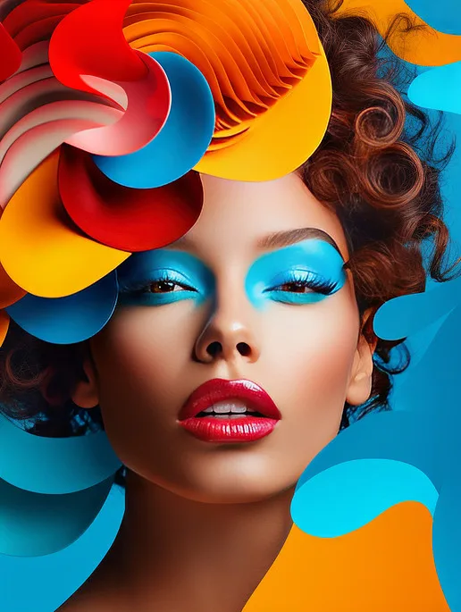
Saturated, vivid colors — magentas, electric blues, deep emerald greens — read as bold, creative, and intentional. These work best for subjects who are building personal brands or creative identities where standing out is part of the objective.
Muted, desaturated tones — dusty rose, sage, warm sand — feel approachable and contemporary. They're heavily used in personal branding photography for coaches, therapists, and lifestyle entrepreneurs because they're warm and differentiated without being aggressive.
Understanding where your subject wants to land on these spectrums is the first step in making intentional color choices. We cover this in the pre-session consultation for studio portrait bookings because the color direction shapes every other decision in the shoot.
Approach 1: Color Through Wardrobe
Wardrobe is the most direct and controllable way to introduce color into a portrait, and it requires no specialized equipment — just preparation.
The key principle is intentionality. Color introduced through clothing should either:
- Harmonize with the overall palette of the image — warm clothing against a warm backdrop, creating a cohesive total impression
- Create deliberate contrast — a single bright color against an otherwise neutral frame, which draws the eye powerfully to the subject
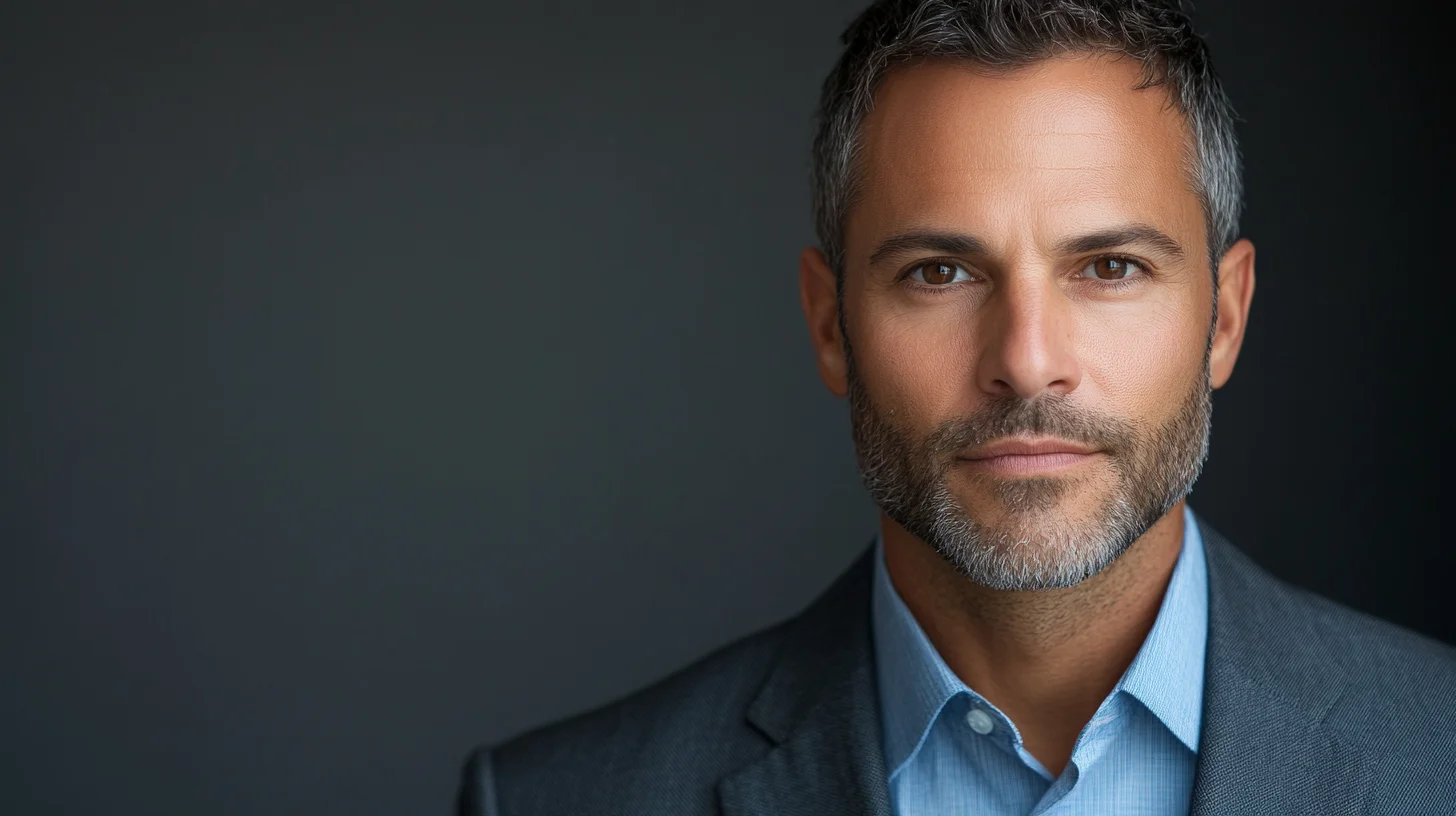
For headshot sessions, wardrobe color decisions have real consequences for how the image performs professionally. A deep teal blazer against a light gray background creates a strong, clean impression on a LinkedIn profile. The same blazer against a competing-colored backdrop creates visual noise.
Practical wardrobe guidance for color portraits:
- Jewel tones photograph exceptionally well — emerald, sapphire, burgundy, deep plum. These colors have enough saturation to read clearly in an image without becoming overwhelming.
- Avoid very light pastel tones in low-key lighting — they can wash out against certain backgrounds or under dramatic lighting and lose their distinctiveness.
- Consider how the color works with your skin tone specifically. Warm skin tones tend to pop against complementary cool backgrounds. Cooler or more neutral skin tones often look striking in warm, saturated clothing against neutral backgrounds.
- Bring more than one option. We almost always find that shooting across two or three wardrobe choices in a single session produces a stronger gallery overall than committing to one look.
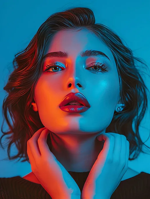
Approach 2: Color Through Lighting
This is where studio photography creates possibilities that outdoor and available-light work simply can't match. Lighting gels — colored filters placed over studio strobes — change the color temperature and hue of the light falling on the subject and/or background. The effects range from subtle to dramatic, and the combinations are essentially unlimited.
At Photography Shark Studios, we use gels as part of creative portrait sessions for clients who want something with an editorial or artistic edge. Specific applications:
Colored background light, neutral subject light. The most common approach: a colored gel on the background light makes the backdrop glow with a specific hue, while the key light on the subject remains daylight-balanced. This creates a vibrant, studio-fashion look where the subject is cleanly lit but the image has strong color interest.
Split complementary lighting. Two gels in complementary or split-complementary colors (warm on one side, cool on the other, for example) create a dramatic chiaroscuro effect. This works particularly well for musicians, performers, and creative professionals whose brand involves a degree of visual drama.
Full gel immersion. All lights, including the key light, use the same or harmonizing gels. The subject is bathed in a single dominant color. This produces a highly stylized look that photographs beautifully for album covers, bold social media content, and creative portfolio work.
Practical light integration. For certain moods, we integrate practical light sources — LED panels in specific colors, neon accent lights — into the frame itself. These appear as visual elements in the image rather than just illuminating the subject, adding environmental context and color texture simultaneously.
Approach 3: Color Through Backgrounds and Environment
Not every color needs to come from a light or a piece of clothing. The environment itself is a rich source of color for portraits, and the South Shore offers a particularly strong range of outdoor portrait contexts:
The tidal marshes along Route 3A through Norwell and Marshfield in late autumn shift into extraordinary amber and gold tones — a natural portrait backdrop that produces images with unmistakable regional character. Shooting environmental portraits here in October or November yields a color palette that no studio can replicate.
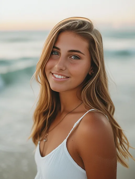
The waterfront in Scituate and Duxbury at golden hour — approximately 90 minutes before sunset — produces warm, low-angled light that saturates everything it touches. Against this light, even neutral-toned clothing becomes rich and dimensional. The visual difference between a portrait shot at noon and one shot at golden hour in these locations is dramatic.
Architecture in downtown Plymouth and Hingham provides saturated blues, greens, and brick reds as environmental backdrops — context for portraits that communicates place and personality simultaneously.
Colorful mural and street art appears throughout Quincy, Weymouth, and parts of South Boston. These environmental backdrops offer vivid, flat colors that can work as strong graphic elements behind a subject, particularly for personal branding portraits.
When planning location portrait sessions for clients who want color-rich images, we scout the light and the environment beforehand to ensure the color relationships in the frame are working together rather than competing.
Approach 4: Color in Post-Processing
Post-processing is where color control reaches its most precise and flexible expression. In Lightroom and Capture One — both of which we use in our editing workflow — every individual color in an image can be independently adjusted for hue, saturation, and luminance. This level of control makes it possible to:
- Shift background colors to better harmonize with or contrast against the subject
- Warm or cool skin tones selectively without affecting the overall image white balance
- Create a consistent color grade across a series of images for a cohesive social media or brand presence
- Develop a signature color palette that becomes part of a client's visual identity
Color grading in portraiture has practical limits. Heavy-handed editing that looks stylized in isolation often looks wrong in the context of the platforms and publications where images actually appear. A heavy teal-and-orange split-tone grade might look cinematic as a standalone print and read as amateur on a LinkedIn profile. We calibrate the editing based on the intended use.
For creative portrait clients specifically, we discuss the intended color grade as part of the session planning process so that the shooting choices — backdrop color, gel choices, wardrobe — are aligned with the editing direction from the start.
The Most Common Color Mistakes in Portraits
Competing colors with no hierarchy. When every element of the frame — background, clothing, props — is a different vivid color, the eye doesn't know where to look. There needs to be a dominant color, a secondary color, and if there's a third, it should be small and intentional.
Color that fights the skin tone. Certain hue combinations are unflattering for specific skin tones in ways that aren't immediately obvious until you see the image. Chartreuse and lime green are particularly difficult against a wide range of skin tones. Pure white creates extreme contrast problems with darker skin tones in certain lighting setups.
Over-saturating in post. Cranking the saturation slider makes skin tones orange and every other color radioactive. Selective saturation — bringing specific colors up without affecting others — is almost always better than global saturation adjustment.
Color for color's sake. Color should serve the image and the subject. If a color choice is disorienting or draws attention to itself rather than to the person in the frame, it's working against the portrait.
Bringing It Together
The most effective color portraits emerge from decisions made cohesively across all four of these approaches. The wardrobe, the lighting, the environment, and the post-processing should feel like they're working together toward a single visual intent — not like four independent choices that happened to end up in the same frame.
This coherence is what we work toward in every session at Photography Shark Studios, whether we're shooting a bold creative portrait with full color gels or a warmer, subtler lifestyle portrait for a client who wants personality without drama.
Ready to Book Your Session?
Photography Shark Studios is located at 83 E Water Street, Rockland, MA, and serves portrait clients from across Boston and the South Shore — Hingham, Norwell, Scituate, Cohasset, Duxbury, Plymouth, Quincy, Weymouth, Hanover, Marshfield, and beyond.
Whether you're looking for a clean professional headshot or a fully creative portrait session that uses color boldly, we're equipped to produce it.
Contact Photography Shark Studios to schedule your portrait session or ask any questions about our process and pricing.
What headshots cost in Boston · Rockland, MA headshot studio · Professional headshots in Weymouth · Studio headshots near Scituate
Frequently Asked Questions
Does Photography Shark offer colorful backdrop options for studio sessions?
Yes. The studio at 83 E Water Street, Rockland MA has a range of backdrop options beyond standard gray or white. Chris discusses backdrop color during the pre-session consultation based on your wardrobe, skin tone, and intended use of the images.
Can I request colored lighting gels for a creative headshot or branding session?
Yes. Lighting gels and creative color treatments are available for studio sessions. These work best for personal branding, creative industry headshots, and studio portrait shoots. Discuss your vision when booking to ensure the setup matches your goals.
What wardrobe colors work best for a colorful portrait session?
Bold, saturated colors read well against neutral backdrops. Muted, desaturated tones work for approachable personal branding. Avoid wearing a color that competes with a planned backdrop. Chris covers wardrobe coordination in the pre-session consultation included with every booking.
Are colorful portrait sessions more expensive than standard studio headshots?
Not necessarily. Studio headshot packages start at $395 for 30 minutes with 10 edited images. Color-creative sessions typically fit within the standard package structure — the difference is in planning, backdrop, and lighting setup, not a separate pricing tier.
What types of clients book creative color portrait sessions at Photography Shark?
Creative professionals, coaches, therapists, social media influencers, and personal brands looking to stand out are the most common clients for color-forward sessions. Chris has experience tailoring color palettes to match brand identity and intended platform use.
How does Photography Shark handle color in post-processing?
Color grading is part of the retouching workflow for every session. Chris can enhance, shift, or tone down color in post-production to match your brand palette or preferred aesthetic. Discuss specific color goals during your pre-session consultation.
Related Posts
Photography Tips
Scituate Senior Portraits at the Beach
Photography Tips
Color Theory in Photography: A Practical Guide
Photography Tips
The Model's Bill of Rights: Safety Standards Every Ethical Photographer Should Follow

Photography Tips
Free Model Release Form Template (Plus How to Read One Before You Sign)
Photography Tips
The Model Safety Checklist: 25 Things to Do Before, During & After a Shoot
Photography Tips
Bad Headshots: 12 Things That Make a Headshot Look Unprofessional (and How to Fix Them)
You Might Also Like
About the Author
Chris McCarthy
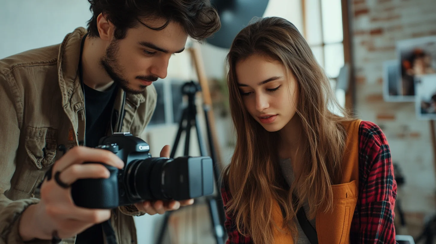
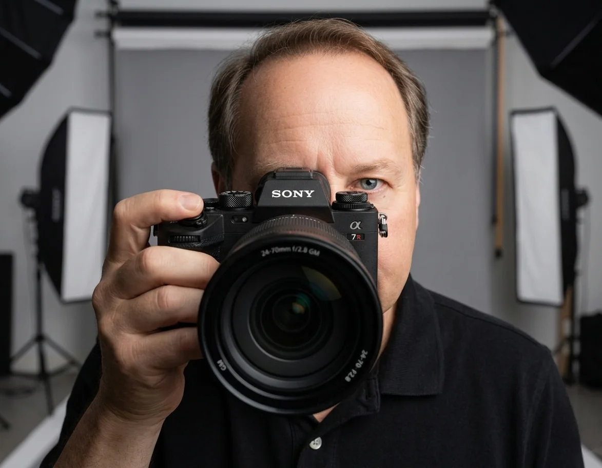
Chris McCarthy has run Photography Shark Studios in Rockland, MA for over 10 years and 500+ sessions, with executive headshot work for Rockland Trust, Clean Harbors, M&T Bank, and McCarthy Planning; founder portraits for AI startups including Lowtouch.ai; product photography for South Shore brands like Lauren's Swim; and headshots across South Shore legal, medical, financial, and academic practices. Every session is personally shot and edited by Chris on Sony mirrorless and Godox strobe systems — no assistants, no outsourcing, no batch retouching. Galleries deliver in 3–5 business days. About Photography Shark →
Photography Shark · Boston & South Shore MA
Ready to Book a Session?
Professional headshots, senior portraits, boudoir, and model portfolios. Studio in Rockland, MA — 25 miles south of Boston. Sessions from $395.