
Headshots
LinkedIn Cover Photo Ideas: Banners, Quotes, and What Actually Works in 2026
A practical guide to the LinkedIn cover photo (the banner behind your profile) — sizing, design ideas, when to use a quote, and how it should pair with your headshot to build a coherent professional brand.
Chris McCarthy
Professional Photographer, Photography Shark · June 9, 2026
Your LinkedIn cover photo — the wide banner that sits behind your profile picture — is one of the most underused pieces of real estate in professional networking. Most people leave it on the default blue gradient or fill it with a stock skyline, which wastes a prime spot to reinforce who they are and what they do. This guide covers what actually works: correct sizing, design ideas that hold up, when a quote helps versus when it's a cliché, and — most importantly — how the banner should pair with your headshot so your whole profile reads as one coherent brand. I shoot LinkedIn headshots in a studio south of Boston, and the question I get most after a session is "what do I put behind it?" Here's the full answer.
First, the Specs (Get These Right)
The LinkedIn cover photo is 1584 x 396 pixels — a 4:1 ratio. A few rules that save people from a blurry or awkwardly-cropped banner:
- Upload at full resolution. Anything smaller gets upscaled and looks soft. PNG keeps text crisp; a high-quality JPG is fine for photographic banners.
- Mind the bottom-left dead zone. On desktop, your circular profile photo and name overlap the lower-left of the banner. Keep critical text and logos in the center or upper-right so nothing important gets covered.
- Design for both desktop and mobile. LinkedIn crops the banner differently across devices. Test how it looks on your phone after uploading — the safe zone is the horizontal center band.
- Don't crowd it. Empty space reads as confident and modern. A banner stuffed edge-to-edge with text, logos, and icons reads as a flyer.
The Banner's Real Job
Before any design idea, understand what the banner is for. It is context for your headshot. The headshot answers "who is this person?" The banner answers "what do they do, and why should I care?" — in one glance, before anyone reads your headline.
That framing kills the most common mistake: treating the banner as decoration. A stock photo of a sunset or a generic city skyline decorates the space without saying anything. The strongest banners do a job: they state positioning, show proof, or set a tone that matches the person in the headshot.
Banner Ideas That Actually Work
1. The Value Statement
The highest-performing banner for most professionals is simply a clear, short statement of what you do and who you help, set in clean type on a brand-colored background. Something like "I help SaaS founders turn churn into retention" or "Estate planning for South Shore families." It works because it does the banner's job directly — positioning, in plain language, legible in a second.
Pair it with two or three brand colors and plenty of negative space. This is the safest, most effective default, and it beats a clever quote nine times out of ten.
2. A Subtle Quote (Done Right)
A quote can work — but only under specific conditions. It should be one line, legible at a glance, and genuinely yours rather than a famous-person cliché everyone has seen. "Be the change you wish to see" on a banner reads as filler. A line that captures how you actually operate — "Measure twice. Ship once. Sleep well." — reads as personality.
If you use a quote, treat it like the value statement: clean type, brand colors, space around it. And never let the quote compete with your headshot for attention. The headshot is the star; the banner is the supporting cast. The most common quote-banner failure is making the text so large and busy that the eye doesn't know where to land.
A note on the "LinkedIn cover photo quotes" trend specifically: there's a whole genre of pre-made quote banners floating around, and the problem with using one is that thousands of other people are using the same file. A quote only differentiates you if it's specific to you. Generic motivation is wallpaper.
3. Proof and Credibility
If you have credibility markers, the banner is a great place to show them quietly: a row of recognizable client or media logos, a key stat ("$40M in closed listings"), a credential, or a tasteful "as featured in" strip. This works especially well for consultants, advisors, agents, and anyone whose buyers care about track record. Keep it to one type of proof — a banner trying to show logos and stats and a tagline becomes noise.
4. Brand or Product Visual
Founders and creators can use the banner to show the thing they make — a clean product shot, an app screenshot, a workspace, the venue. For a personal brand built around a craft (a photographer, a designer, a chef), a single strong example of the work can be more persuasive than any words. This pairs naturally with broader personal branding photography, where the banner image and the headshot come from the same coherent shoot.
5. On-Brand Photography (Coordinated With Your Headshot)
The most polished profiles use a banner image shot in the same session as the headshot — same lighting, same color world, same wardrobe energy — so the two images read as one set. A wide environmental or studio frame behind a matching tight headshot looks deliberately art-directed, because it is. When clients book a session, I'll often shoot a 4:1 wide frame specifically for the banner alongside the headshot crop, so the whole profile lands as a unit instead of a mismatched pair.
The Pairing Problem: Banner + Headshot Together
Here's the thing almost no banner guide mentions: the banner and headshot are seen together, and they either reinforce each other or fight.
Three quick rules for making them work as a pair:
- Color coordination. If your headshot has a cool charcoal background and your banner is a warm orange gradient, the two clash and the profile feels accidental. Pull the banner's colors from the same family as your headshot's background and wardrobe.
- Tonal match. A formal, composed executive headshot under a playful comic-sans quote banner sends two contradictory signals. The banner's mood should match the headshot's mood.
- Don't double up on the face. Avoid putting a second large photo of your face on the banner. One clear image of you (the headshot) plus context (the banner) is cleaner than two competing portraits.
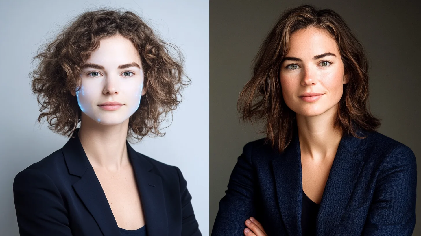
This is exactly why the headshot comes first. A great banner can't rescue a weak profile photo, but a weak banner can undermine a great headshot. Get the LinkedIn headshot right — properly lit, tightly cropped, warm and readable at thumbnail scale — and then design the banner to frame it.
Tools to Build One
You don't need a designer for most of these. Canva has correctly-sized LinkedIn banner templates (search "LinkedIn banner," 1584 x 396) that you can customize with your colors and copy in a few minutes. Figma works if you want more control. The key discipline regardless of tool: pick your two or three brand colors first, write the one line of copy first, and then design — not the other way around. Designing before you know your message is how banners end up cluttered.
Common Mistakes
- The default blue gradient. Leaving it empty signals you haven't thought about your profile. Even a simple value statement beats the default.
- A generic skyline or sunset. Decorative, says nothing, used by everyone.
- Text in the bottom-left. It gets covered by your profile photo and name on desktop.
- Low resolution. Blurry banners undercut the professionalism you're trying to project.
- Cramming everything in. Logos plus stats plus a quote plus a tagline equals visual noise.
- A quote that's a cliché. If a million other people could use the same line, it isn't differentiating you.
- Clashing with the headshot. The most-missed mistake. They're seen together; design them together.
Put It Together
The winning formula for most professionals: a clear one-line value statement (or a genuinely personal quote), set in clean type, in colors that complement your headshot's background and wardrobe, with the key text centered away from the bottom-left, uploaded at full 1584 x 396 resolution. Simple, coordinated, and doing the banner's actual job — giving context to the most important image on your profile.
Ready to Get the Headshot Right First?
The banner frames the headshot, so start with the headshot. Get in touch to book a LinkedIn headshot session at Photography Shark in Rockland, MA — and ask about shooting a coordinated 4:1 banner frame in the same session so your whole profile reads as one polished set. Sessions start at $395 with fully retouched, licensed files.
Related reading: LinkedIn headshots Boston · Boston headshot sessions · Professional headshot examples by industry · Personal branding photography · What to wear for a professional headshot
Frequently Asked Questions
What is the correct LinkedIn cover photo size in 2026?
The LinkedIn cover photo (also called the banner or background photo) is 1584 x 396 pixels, a 4:1 ratio. Keep important text and graphics in the center and away from the bottom-left corner, where your profile photo and name overlap the banner on desktop. Upload at full resolution as a PNG or high-quality JPG so text stays crisp.
Should I put a quote on my LinkedIn banner?
A quote can work if it's short, genuinely reflects how you operate, and is legible at a glance — but most strong banners lead with a clear value statement (what you do and who you help) rather than a generic inspirational quote. If you use a quote, keep it to one line, make it your own positioning rather than a famous-person cliché, and ensure it doesn't compete with your headshot for attention.
What makes a good LinkedIn cover photo?
A good LinkedIn cover photo reinforces your professional positioning in one glance: clean layout, a clear focal message or relevant imagery, brand colors that complement (not clash with) your headshot, and enough empty space that it doesn't look cluttered. It should answer "what does this person do and why should I care" before anyone reads your headline.
Does the LinkedIn banner matter as much as the headshot?
No — your headshot is the single most important image on your profile because it appears everywhere LinkedIn shows you, including search, feed, and messages. The banner is secondary but valuable real estate that frames the headshot and adds context. Get the headshot right first, then design a banner that complements it.
Related Posts

Headshots
LinkedIn Profile Photo Guide: How to Get It Right in 2026
Headshots
Are AI Headshot Generators Worth It for LinkedIn?

Headshots
The Hidden Cost of a Bad LinkedIn Photo

Headshots
LinkedIn Headshots in Boston: What Works
Headshots
The Importance of a Great LinkedIn Headshot

Headshots
Headshots With Glasses: How to Avoid Glare and Look Your Best
You Might Also Like
About the Author
Chris McCarthy
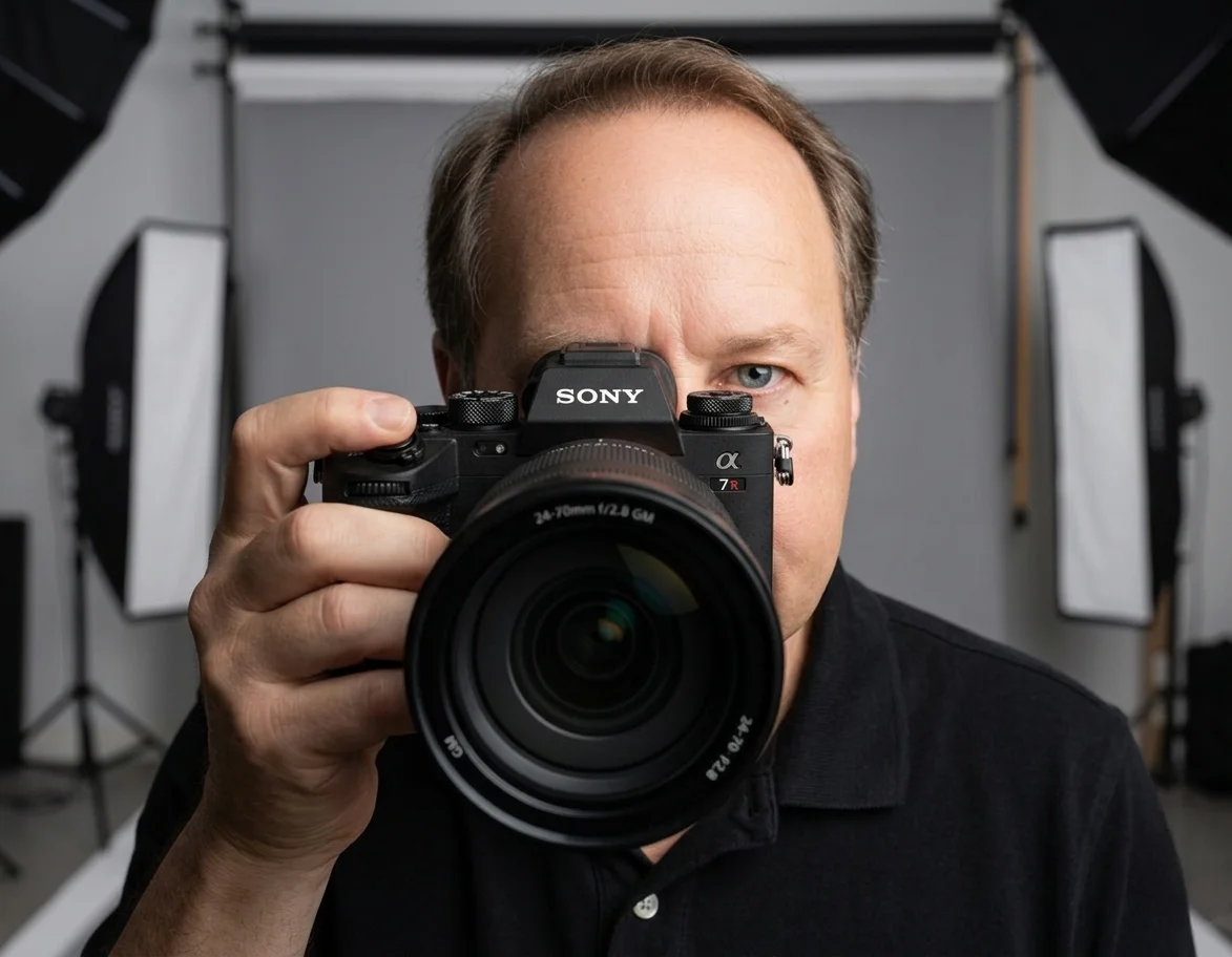
Chris McCarthy has run Photography Shark Studios in Rockland, MA for over 10 years and 500+ sessions, with executive headshot work for Rockland Trust, Clean Harbors, M&T Bank, and McCarthy Planning; founder portraits for AI startups including Lowtouch.ai; product photography for South Shore brands like Lauren's Swim; and headshots across South Shore legal, medical, financial, and academic practices. Every session is personally shot and edited by Chris on Sony mirrorless and Godox strobe systems — no assistants, no outsourcing, no batch retouching. Galleries deliver in 3–5 business days. About Chris McCarthy →
Photography Shark · Boston & South Shore MA
Ready to Book a Session?
Professional headshots, senior portraits, boudoir, and model portfolios. Studio in Rockland, MA — 25 miles south of Boston. Sessions from $395.