Photography Tips
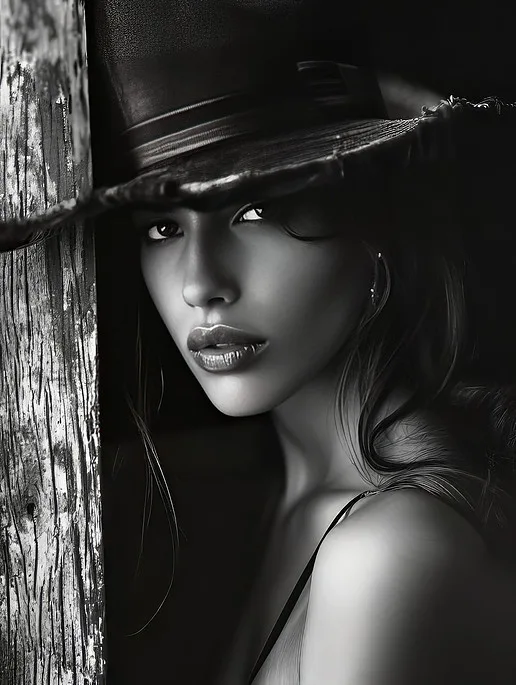
Black and White Portrait Photography: When and Why
When and why Photography Shark shoots black and white portraits — visualizing luminance, wardrobe choices, and tonal contrast for studio and location.
Chris McCarthy
Professional Photographer, Photography Shark · January 5, 2025 · Updated March 5, 2026
Black and white photography has survived every technological revolution in its medium — from daguerreotype to film to digital — not because it is traditional, but because it does something that color photography cannot. When you remove color from an image, you redirect the viewer's attention to the elements that make a photograph powerful at a more fundamental level: light, shadow, form, texture, and expression. Nothing is hidden behind interesting color. The photograph either works or it does not.
In my experience working with clients across Boston and the South Shore, the biggest gains come from the simplest adjustments.
At Photography Shark in Rockland, MA, black and white is a deliberate tool in the portrait workflow — not a filter applied after the fact to make an average photo look more artistic, but a considered choice made at the planning stage about when removing color will strengthen a specific image. This guide explains the technical and aesthetic principles behind that choice, along with practical guidance for photographers who want to develop serious black and white capability in their own work.
Why Black and White Still Matters in Portrait Photography
Color is information. It draws attention, communicates temperature and mood, and provides visual differentiation between elements in a frame. Most of the time, that information serves the image. But color can also be a distraction — a bright jacket that competes with the face, a background that clashes with the subject's skin tone, a color cast that works against the emotional register of the image.
Black and white conversion eliminates that distraction. When two elements in a frame have similar luminance values but different colors, color photography distinguishes them clearly; black and white merges them into the same tonal zone. Skilled black and white photographers understand this and use it deliberately — composing frames where the important distinctions are tonal rather than chromatic, where the subject stands out because it occupies a different luminance level than its surroundings.
Beyond distraction management, black and white photography has a particular emotional quality that color cannot replicate. Images shot in black and white feel more timeless — they are less tied to a specific decade or season, because color is one of the primary cues that dates a photograph. A black and white portrait made today can feel as immediate as one made in 1965, in a way that a color portrait simply cannot.
For portrait work specifically, black and white shifts emphasis toward the face and expression. Without color demanding attention, the viewer's eye moves directly to the features, the light on the skin, the quality of the gaze. This makes black and white an especially effective choice for character studies, for subjects with strong, expressive faces, and for any portrait where the emotion is the point.
Seeing in Black and White: Learning to Visualize the Conversion
The technical challenge of black and white photography begins before you press the shutter: you have to develop the ability to look at a scene and predict how it will translate to monochrome, rather than simply shooting in color and deciding later that you want to convert.
The critical variable is luminance — the brightness of different elements within the frame relative to each other. Elements that are different colors but similar in luminance will compress toward the same tonal zone in a black and white conversion, potentially merging in ways that reduce clarity and visual separation. Elements that are different in luminance but similar in color will separate clearly in black and white, sometimes creating tonal distinctions that were not visually obvious in color.
A classic example: a red object and a green object that have similar luminance values (roughly equal brightness despite different hues) will convert to nearly the same gray in a standard black and white conversion. The color difference disappears entirely. If the red object is your subject and the green object is the background, you lose all separation. On location at a senior portrait session or a family photo session, this means making wardrobe and location choices with an eye toward tonal contrast, not just color harmony.
The Camera's Live View Assist
Most modern cameras — including Sony mirrorless bodies — offer a black and white preview mode that shows the live view in monochrome while still recording the full color RAW file. This is an extremely useful tool for developing visualization skills: you see approximately how the scene will convert while still having the full color information available in post for maximum flexibility.
This approach — visualize in black and white, shoot in color RAW, convert in post — gives you the best of both worlds. You train your eye to see tonally while retaining the flexibility to make color-adjusted conversions that maximize tonal separation.
Lighting for Black and White: Direction, Contrast, and Drama
If color photography rewards beautiful light of any quality, black and white photography specifically rewards directional, contrasted light. The absence of color means the entire visual interest of the lighting setup must come from the distribution of light and shadow across the frame. Flat, even, undirected light — which can look clean and contemporary in color — looks blank and lifeless in black and white.
Hard Light and Texture
Hard light — from a relatively small, distant source — creates sharp-edged shadows and strong contrast. In color photography, hard light is usually considered unflattering because of its harshness. In black and white, hard light becomes a powerful tool for revealing texture and creating drama. The harsh shadow under a cheekbone, the deep socket shadow around the eye, the crisp edge between the lit and unlit sides of the face — all of these are exactly what gives a black and white portrait its character.
This is why dramatic studio lighting setups like Rembrandt lighting and split lighting, which many color portrait photographers avoid, are regularly used in black and white work. The contrast is the point.
Window Light in Monochrome
A north-facing window on an overcast day — the classic painter's light source, and the one Rembrandt used for his portraits — produces directional, moderately soft light with enough contrast to create dimensionality without the harshness of direct sun. This is genuinely excellent light for black and white portraiture: the shadows are defined but gradual, the tonal range is wide but not extreme, and the light has a quality that feels timeless rather than contemporary.
At Photography Shark's studio in Rockland, window light is used for certain portrait setups that are specifically intended for black and white output. The quality is different from strobe lighting in ways that are subtle but meaningful in the final image.
Golden Hour in Black and White
The warm, golden quality of late-afternoon sun on the South Shore — which is one of the most beautiful color photography conditions you can find — translates to black and white differently than you might expect. The warmth disappears (it is a color property), but the direction and the contrast remain. Golden-hour black and white portraits have strong, low-angle shadows that create dramatic, sculptural lighting.
What is lost in the black and white conversion is the warm-cool interplay that makes golden-hour color photographs so visually appealing. What remains is pure light geometry: the direction of the sun, the depth of the shadows, the luminous glow of backlit hair. This is worth considering when deciding whether a specific golden-hour session is better served by color or black and white output.
Post-Processing Black and White: Beyond Desaturation
Converting a color image to black and white involves far more than removing the color information. The most important tool in the black and white conversion workflow is the color mixer (sometimes called the HSL panel or the color channel mixer in older workflows), which controls how each individual color in the original image translates to gray.
The Color Channel Mixer
Every black and white conversion software — Lightroom, Capture One, Silver Efex Pro, Photoshop — offers a version of this tool. It lets you specify, for each color (red, orange, yellow, green, aqua, blue, purple, magenta), how bright or dark that color should appear in the final black and white image.
The practical applications for portrait photography:
Skin tones are primarily composed of red and orange. Raising the red and orange channels brightens skin tones in the black and white conversion, which is generally flattering — it creates luminous, bright skin that separates from darker backgrounds.
Blue sky can be dramatically darkened by reducing the blue and aqua channels. A bright blue sky at the beach in Duxbury or Scituate converts to a nearly white, bland gray in a default black and white conversion; reducing those channels turns it to a deep, almost black sky that makes clouds pop with dramatic contrast reminiscent of classic landscape photography.
Green foliage can be brightened (raising the green channel) or darkened (lowering it) to control how tree canopies and grass read relative to other elements in the frame.
These adjustments are the primary creative lever in black and white conversion, and they are the reason why a technically informed black and white conversion looks dramatically better than simply desaturating a color image.
Tonal Curves and Contrast
After the color mix, tonal curves control the overall contrast and tonal distribution of the image. The classic black and white portrait conversion tends toward an S-curve — slightly deepened shadows, slightly brightened highlights, with a steeper mid-tone slope that adds punch to the middle values. This mimics the contrast characteristics of traditional orthochromatic or panchromatic film stocks, which had different tonal responses than digital sensors.
Film Grain
One of the most effective ways to give a black and white conversion a sense of depth and materiality is to add a small amount of film grain. Digital images without grain have a smooth, plastic quality that becomes visible in black and white in a way it often does not in color. A moderate grain layer — enough to give the image texture but not enough to appear as obvious noise — restores a sense of photographic physicality that improves the final image.
Vignetting
A subtle darkening of the corners — a vignette — directs the viewer's eye toward the center of the frame. In black and white portrait photography, this technique has a long history in darkroom work (burning the edges of a print) and translates naturally to digital post-processing. The vignette should be subtle enough to be felt rather than obviously seen.
Choosing Subjects for Black and White
Not every photograph benefits from black and white treatment. Developing a reliable editorial sense about when to convert and when to stay in color is one of the marks of a photographer with genuine black and white competence.
Convert to black and white when:
- Color is distracting from the emotional content of the image
- The lighting is dramatic and directional with strong shadow
- The subject has expressive, textured features that benefit from tonal emphasis
- The composition has strong geometric clarity that color complicates
- The palette of the original image is muddy, desaturated, or clashing
Stay in color when:
- The color is itself a central element of the image
- The light quality (golden hour warmth, blue-hour cool) is part of the aesthetic
- The subject's clothing makes a deliberate color statement
- The environment is defined by its color (autumn foliage at the North River, the blue-green Atlantic at Nantasket)
Black and White for Professional Headshots
Black and white headshots occupy an interesting position in professional photography. They have a long history in theater and film — the classic 8x10 headshot of the mid-twentieth century was invariably black and white — and they retain a certain gravitas in those industries. For actors and performers seeking headshots, a black and white option alongside the standard color set is still often appropriate.
For corporate and business headshots — LinkedIn profiles, company websites, professional bios — color is now the universal standard, and a black and white submission tends to read as idiosyncratic rather than distinctive. The exception is certain editorial and journalism contexts, where a strong black and white portrait of a subject can communicate seriousness and authority that color sometimes dilutes.
At Photography Shark, we discuss the appropriate output format in the pre-session consultation. Many portrait sessions include both color and black and white selects — images chosen specifically for each format rather than every color image automatically converted.
Black and White in the South Shore Landscape
The South Shore of Massachusetts offers specific black and white opportunities that differ from its color photography strengths. The granite coastline — particularly the rocky formations at Minot Beach in Scituate and at the northern end of Nantasket Beach in Hull — translates beautifully to black and white, where the texture of the granite and the tonal interplay between wet rock and sky create images with enormous graphic strength.
The dune grass at Duxbury Beach, which is a muted straw color in late summer and fall, converts to rich, textured tones in black and white that bring out the physical quality of the grass in ways that color sometimes softens. The wide open sky over Duxbury Beach on a partly cloudy day — when the clouds have dark bases and bright tops — becomes dramatic and three-dimensional in black and white with the right conversion settings.
For family portrait sessions or senior portrait packages with a timeless, heirloom aesthetic, black and white is a natural fit. The images will not be dated by hairstyles or clothing trends in the way color photographs are. Twenty years from now, a well-made black and white portrait from Minot Beach will look as current as it does today.
Ready to Book Your Session?
Photography Shark serves clients throughout the South Shore and Greater Boston for headshots, senior portrait packages, and family photography. Our studio is at 83 E Water Street in Rockland, MA. Whether you want dramatic black and white studio portraits, environmental black and white outdoor sessions, or a mix of color and monochrome in a single session, we have the technical knowledge and aesthetic judgment to deliver it.
Frequently Asked Questions
Can I request black and white edits for my Photography Shark portrait session?
Yes. Chris McCarthy selects black and white conversions when they strengthen specific images. You can also request black and white treatment during the session consultation, and it can be applied to any of your delivered images.
What wardrobe works best for black and white portraits?
Tonal contrast matters more than color in black and white. Avoid matching the luminance of your clothing to the background. Discuss wardrobe with Chris before your session at the Rockland studio to plan for both color and black and white options.
Does Photography Shark deliver both color and black and white versions of images?
Edited image counts — 10, 15, or 20 depending on your package — reflect final selects. Black and white and color versions of the same image can be discussed during the retouching stage. Ask Chris about this when you book.
What types of portrait sessions benefit most from black and white?
Character-driven headshots, expressive senior portraits, and any session focused on emotion and light quality benefit most. Black and white is less common for family photos where color and wardrobe coordination are part of the aesthetic.
How long does it take to receive edited photos after a session?
Turnaround time at Photography Shark is typically one to two weeks after your session. Chris will confirm the expected delivery date at the time of your session.
Related Posts


You Might Also Like
About the Author
Chris McCarthy
Chris McCarthy has run Photography Shark Studios in Rockland, MA for over 10 years and 500+ sessions, with executive headshot work for Rockland Trust, Clean Harbors, M&T Bank, and McCarthy Planning; founder portraits for AI startups including Lowtouch.ai; product photography for South Shore brands like Lauren's Swim; and headshots across South Shore legal, medical, financial, and academic practices. Every session is personally shot and edited by Chris on Sony mirrorless and Godox strobe systems — no assistants, no outsourcing, no batch retouching. Galleries deliver in 3–5 business days. More about the photographer →
Photography Shark · Boston & South Shore MA
Ready to Book a Session?
Professional headshots, senior portraits, boudoir, and model portfolios. Studio in Rockland, MA — 25 miles south of Boston. Sessions from $395.