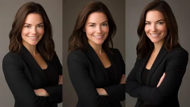
Headshots
Headshot Background Colors: Which One Is Right for You?
Mid-gray is the safe default for LinkedIn, law, and finance. When white, black, or a brand color is the better call, and which shades flatter which skin tones, from a Boston studio headshot photographer.

Chris McCarthy
Professional Photographer, Photography Shark · February 21, 2026 · Updated September 29, 2026
Background color is one of the most underrated choices in a headshot. Most clients focus on wardrobe and expression — both correctly — and treat background as an afterthought, which is often how they end up with images that don't match the platform they need them for. A good background choice isn't about aesthetic preference. It's about where the image will actually be seen and what signal it needs to send when it gets there. Here's how to think about the options for your Boston headshot session.
White Backgrounds
White backgrounds read clean, modern, and slightly clinical. They work well for corporate websites with minimalist designs, medical and healthcare contexts, and anyone whose branding leans toward "clean and straightforward" rather than "warm and approachable."
The downside: white backgrounds can feel cold if the lighting isn't handled correctly, and they demand perfect wardrobe. Any visible stray thread, wrinkle, or lint shows up more on white than on darker backgrounds. They also push a lot of responsibility onto expression — with no atmosphere from the background, the subject's face is doing all the work.
Best for: corporate websites, press releases, medical profiles, anyone needing a very clean institutional feel.
Gray Backgrounds
Gray — specifically a medium-light gray — is the most versatile background in professional headshot work. It reads neutrally across industries, handles web page designs from dark mode to light, compresses well on LinkedIn, and doesn't date.
The reason gray is the default for so many LinkedIn headshots is that it works: recruiters and viewers can focus on the face without the background sending a specific signal. It's the "safe, not boring" choice.
Within gray, there's a spectrum. Lighter grays read cleaner and more corporate. Darker grays feel more editorial and slightly more dramatic. The sweet spot for most clients is a medium-light gray — it has enough tone to feel intentional without overwhelming the subject.
Best for: LinkedIn profiles, executive headshots, anyone who needs one image that works across many contexts.
Black Backgrounds
Black backgrounds produce the most dramatic headshots. They work especially well for actors, authors, creatives, musicians, and personal brands that benefit from a more editorial feel.
The trade-off is specificity. A black-background headshot sends a clear signal — confident, deliberate, often creative — and that signal either fits the context or it doesn't. Using a black-background headshot for a conservative corporate role can read as off-key.
Black backgrounds also interact with wardrobe in a specific way: dark clothing disappears into the background, which can either be a strength (letting the face dominate) or a weakness (making the subject look disembodied). Wardrobe choices for black-background headshots usually skew toward mid-tone or lighter pieces.
Best for: actor headshots, author photos, creative personal branding, editorial contexts.
Colored Backgrounds
Muted colored backgrounds have become much more common in the last few years, driven partly by personal branding and partly by platforms where standing out from a sea of gray images matters.
Deep blues, sage greens, warm beiges, and soft pastels can all work — when they're chosen deliberately and the client's wardrobe, skin tone, and intended use align with the choice. A deep blue background can feel elevated and professional; a bright yellow can feel creative and approachable. The common mistake is picking a color because the client likes it without thinking about whether the image will actually work where it's being used.
Colored backgrounds demand more thought at the consultation stage. Wardrobe needs to complement the background without clashing. Skin tones interact with background color in ways that aren't obvious in advance — warm-toned skin against a warm background can flatten; cool skin against a saturated warm background can create tension.
Best for: personal brands, creative industries, speakers and coaches, anyone who wants their headshot to feel less generic.
Which Backgrounds Flatter Which Skin Tones
Background color interacts with skin tone, and some pairings flatter while others fight.
| Skin tone | Backgrounds that flatter | Backgrounds to avoid |
|---|---|---|
| Very pale | Warm gray, cream, soft beige | Pure white (washes out), pure black (high contrast can be harsh) |
| Light | Most options work | Same-tone wardrobe-background pairings |
| Medium | Most options work | Pure white can lose dimension on the face |
| Olive | Warm gray, charcoal, navy, cream | Cool blue (color cast clash) |
| Tan | White, warm gray, navy, charcoal | Yellow-green (clash with warm undertones) |
| Brown | Charcoal, white, warm gray, navy | Mid-brown (low separation) |
| Deep | Light backgrounds for separation | Dark backgrounds without strong rim/edge lighting |
Lighting can rescue a poor pairing, but it takes more correction in post and rarely looks as natural as a good pairing from the start.
Mixing Backgrounds in One Session
Most sessions at the studio include at least two background options. This isn't upselling — it's recognizing that clients often need images for different contexts, and locking into a single background can leave you underserved.
A common combination:
- Medium gray for LinkedIn and the main website
- Black for editorial use or bio pages that need more drama
- One colored option (often a muted blue or green) for social media where the gray-background norm is visually exhausting
The studio has white seamless, several gray and charcoal seamless rolls, navy, and a brick wall. The 30-minute studio package includes two backgrounds. Longer sessions accommodate three. Choices are discussed during the consultation so lighting can be set up appropriately for each — different backgrounds require different lighting adjustments, and this is part of what takes session time.
What to Consider Before Your Session
Before picking backgrounds, answer three questions:
Where will the image actually be used? LinkedIn, website, press kit, casting submissions, internal directory — each has slightly different expectations. If the primary use is one specific platform, let that drive the primary choice.
What industry context is the image operating in? Conservative industries (finance, law, medicine) still default toward white and gray. Creative industries have more latitude. Personal brands and speakers have the most.
What does your wardrobe commit to? Dark wardrobe disappears into black. White wardrobe blends into white. The color palette of your outfits affects which backgrounds will actually photograph well — see what to wear for a professional headshot.
The Default Recommendation
If you're booking a session and unsure, the standard recommendation is: medium-light gray plus one other option. Gray for the primary use; the second option for variety. You'll get images that work across platforms and won't feel locked into a single aesthetic.
The Color Science Behind Background Choice
The reason some background choices feel "off" even when the wardrobe and expression are dialed in usually traces back to one of three measurable color science variables. Understanding them lets you make a deliberate choice rather than picking by gut.
Color temperature mismatch. Studio strobes — in my case Godox AD600Pro packs firing through softboxes and umbrellas — output light at approximately 5500K daylight balance. The seamless paper backdrops are manufactured under that standard. When a client photographs better against one gray than another, the issue is often that one paper is slightly warmer (leaning yellow at around 5300K under flash) and the other is slightly cooler (leaning blue at around 5700K). Skin reads warmer against cool gray and cooler against warm gray. Pale skin generally photographs better against the slightly warmer rolls; medium and deeper skin tones often look richer against a slightly cooler gray.
Reflectivity and the "background spill" problem. White seamless paper reflects light back into the subject — sometimes dramatically. A subject standing 4 feet from a brightly lit white background will get a noticeable cool fill on the back of the hair and shoulders. This is invisible to most clients but fights the lighting of the face. We position subjects 6-8 feet off the backdrop for white sessions to control this. Black paper has the opposite problem — it absorbs light, which is why the face needs more deliberate lighting to separate from the void behind.
Hue interaction with skin undertone. Warm-undertone skin (yellow-olive, golden) photographs flat against warm backgrounds (beige, terracotta, warm gray) and pops against cool backgrounds (blue-gray, deep navy, sage). Cool-undertone skin (pink, rosy, neutral) does the inverse — pops against warm backgrounds and can feel washed out against blue-gray. This is why a single "best" colored backdrop does not exist; it depends on the subject in front of it.
In a session at the Rockland studio we test multiple variants live on a calibrated monitor before committing to extended shooting. The client sees the difference immediately when the comparison is on screen rather than imagined.
Background Psychology: What Each Color Actually Communicates
Background color is read by viewers as part of the photograph's message — usually pre-consciously. The signal each color sends has been studied enough that the patterns are predictable.
Pure white signals clinical, modern, institutional. Used heavily by tech companies, medical practices, and minimalist personal brands. Reads as honest and unembellished. The downside: it can read as cold or impersonal, especially without warmth in the wardrobe and expression.
Light gray (around 60-70% reflectivity) signals professional but human. The most-used background in corporate headshot work because it borrows authority from the institutional palette without going as cold as white. Works across LinkedIn, firm bios, and most professional directories.
Mid gray (around 40-50% reflectivity) signals seriousness, gravity, considered. Appears more in editorial photography, executive portraits for annual reports, and book jacket photography. Slightly more dramatic than light gray; less reductive than black.
Charcoal and dark gray (15-30% reflectivity) signal authority and weight. Used for executive and C-suite portraits, legal partner photography, and editorial business publication work. Can feel heavy if the subject's wardrobe and expression do not balance it.
Black signals drama, focus, and creative deliberation. Strong for actor headshots, musician promo, author photos, and personal brands that benefit from an editorial register. Reads as a stylistic statement, which is either a fit or a friction depending on the use.
Muted blue signals competence, trust, and approachability — which is why insurance companies and financial services firms have used variants of it in branding for decades. Photographs well for personal branding, speaker bios, and any context where warmth and authority both matter.
Sage and muted green signal calm, grounded, considered. Increasingly common for therapists, wellness practitioners, coaches, and creative professionals. Works against most skin tones.
Warm beige and sand signal approachable, humanizing, soft. Used in lifestyle-leaning personal branding and for clients who want their headshot to feel less corporate.
Deep navy and burgundy signal traditional, prestigious, established. Common in legal, financial, and executive portraiture where the institutional weight is desired.
Bright saturated colors (yellow, red, teal) signal creative, distinctive, brand-forward. Used sparingly and deliberately — almost always tied to a specific brand identity. Risky as a default but powerful when the use case fits.
Matching Background to Use Case: A Cheat Sheet
For clients booking the studio in Rockland and trying to make a choice in advance, the use case is the simplest filter.
LinkedIn primary photo — light to mid gray. Survives compression, reads neutrally to recruiters, photographs well against most wardrobes. The profile circle displays at roughly 80 pixels, so the face needs to be the brightest thing in it: no dark backdrops, no same-tone-as-clothing backdrops, and no texture that turns to noise at that size.
Executive and C-suite — charcoal, deep gray, navy, or black, paired with darker wardrobe. A navy suit on charcoal reads as authority; the same suit on white can read as too casual. Many firms mandate a specific background for partner photos, so check before booking.
Firm bio for law, finance, accounting — match the firm's spec or default to the firm's palette. If no spec, mid-light gray.
Hospital or clinical directory — white or near-white per most hospital system standards. Confirm with your communications coordinator.
Actor theatrical headshot — varies by market. Boston and New York skew toward muted gray or natural environment; LA more often allows lighter or colored backgrounds. We discuss based on the agent or casting target. Medium gray remains the safe default because it doesn't compete with the face — see actor headshots in Boston for the format-specific breakdown.
Actor commercial headshot — typically lighter, often with a hint of warmth. The audition reader should read approachability immediately.
Author and book jacket — black or deep gray for literary fiction and serious nonfiction; lighter and warmer for business books, self-help, and lifestyle.
Speaker and personal brand — deliberate color often outperforms gray here. The headshot lives next to other speakers' gray-background photos and benefits from differentiation.
Modeling agency submission — clean white or light gray, no styling. Agencies want to evaluate the face without distraction.
Dating profile — soft natural environment if shot on location, or warm light gray if shot in studio. Avoid the institutional look entirely.
Tech and startup — white and light gray dominate. Cleaner and more modern than the darker institutional palette.
Internal corporate directory — match the existing team page. Consistency over distinction.
DIY Backgrounds vs Studio Seamless
Remote work has normalized self-shot headshots, so the question comes up often: can you get a professional background at home?
- A plain painted wall with directional window light can work, barely. You can't swap backgrounds, light quality changes by the hour, and color accuracy depends on the paint.
- Collapsible fabric backdrops produce wrinkles that are extremely difficult to remove in post. They read as "set up in the living room" to anyone who sees professional headshots regularly.
- Virtual or AI-replaced backgrounds are fine for a Zoom call, not for a permanent headshot. The edge masking around hair is almost always wrong, and the light on the subject doesn't match the light the background implies.
Studio seamless is different in three ways. A 9-foot roll of Savage seamless paper sweeps from the wall to the floor, so there is no horizon line. The background is lit separately from the subject, so the same gray roll can read light or dark — which is how three gray rolls produce a dozen different gray looks. And the subject stands 6-8 feet off the paper, so it falls naturally out of focus, a separation that is impossible 18 inches from a wall.
Common Headshot Background Mistakes
These are the errors I see most often in headshots clients bring in from elsewhere:
- Matching wardrobe to background. A navy blazer on navy eliminates the shoulder line; the subject becomes a floating head.
- Standing too close. Two feet from a wall creates hard shadows and makes texture visible.
- A busy environment. Bookshelves, plants, and window blinds compete with the face.
- The wrong background for the platform. A black background that looks stunning full size can swallow the face in a LinkedIn circle.
- A trendy color. The coral and millennial-pink backdrops of 2021 looked dated by 2024. Brick and exposed texture, popular in tech from 2018 to 2022, are dating the same way. Neutrals age better.
- Wrinkled fabric or muslin. Wrinkles are nearly impossible to remove fully and broadcast "temporary setup."
Free download: backdrop, wardrobe and posing tips in one PDF, the same guide clients get before their session.
Ready to Book a Session?
Get in touch and we'll discuss background options during the consultation before your session. Photography Shark is based in Rockland, MA, serving Boston and the full South Shore.
Related reading: How to prepare for your headshot session · Headshot wardrobe guide for men and women · Professional headshot examples · Headshot services & pricing
Frequently Asked Questions
What's the most versatile headshot background color?
A medium-light gray. It reads cleanly on LinkedIn and websites, holds up on dark and light web page designs, and doesn't date as quickly as trendier color backgrounds. If you can only pick one, pick medium gray.
Should I get white, gray, or black backgrounds?
White reads clean and corporate, gray is the most versatile, and black produces more editorial or dramatic images. Most clients at Photography Shark shoot against 2–3 background options in a single session so the final images work across different use cases.
Can I shoot on a colored background for a headshot?
Yes, and it's more common now than it used to be. Muted blues, deep greens, warm beiges, and soft pastels can work well for personal branding, creative industries, and anyone who wants to stand out from a sea of gray-background headshots. They're riskier for traditional corporate settings.
What background color is best for LinkedIn?
Light to mid-tone backgrounds (white, cream, light gray, soft blue, warm gray) are best for LinkedIn because they create the contrast needed for the small circular thumbnail. Avoid very dark backgrounds for LinkedIn primaries — at thumbnail scale, the face can disappear into the background.
Do different platforms have different background requirements?
LinkedIn compresses heavily and favors clean backgrounds that survive compression. Print materials can handle more texture and color. Video platforms (Zoom, conference sites) usually want high-contrast separation between the subject and background. The choice depends on where the image will be used most.
How many background options do you shoot in a session?
Studio headshot sessions at Photography Shark typically include 2 background choices in the 30-minute package and up to 3 in the longer sessions. The choices are discussed during the consultation so lighting and wardrobe can be matched appropriately.
Related Posts



You Might Also Like
About the Author
Chris McCarthy
Chris McCarthy has run Photography Shark Studios in Rockland, MA for over 10 years and 500+ sessions, with executive headshot work for Rockland Trust, Clean Harbors, M&T Bank, and McCarthy Planning; founder portraits for AI startups including Lowtouch.ai; product photography for South Shore brands like Lauren's Swim; and headshots across South Shore legal, medical, financial, and academic practices. Every session is personally shot and edited by Chris on Sony mirrorless and Godox strobe systems — no assistants, no outsourcing, no batch retouching. Galleries deliver in 3–5 business days. More about the photographer →
Photography Shark · Boston & South Shore MA
Ready to Book a Session?
Professional headshots, senior portraits, boudoir, and model portfolios. Studio in Rockland, MA — 25 miles south of Boston. Sessions from $395.